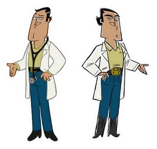
Highly Recommended: Grab an old design and try it again in a different style.
I remember liking this design when I first did it like 5-6 years ago. I think I was trying for a Simpson's type of thing.
When you put something on the back burner too long you run the risk of coming across stuff you like better and then you can't help but be influenced.
~and by you I mean me~
I like the new design better. The style looks like it could be a perfect character on a show called "Phil Henrie" which was made by 6 Point Harness as a pitch. I love the style and it looks great!
ReplyDeleteSteve
Hendrie - it was my inspiration. good eye.
ReplyDeleteI prefer the newer version, with the hard angles. I can totally see that first guy being on Family Guy. I have worked on many shows that I do not like the style of, wishing that I can redesign the characters, like you did here. I love his facial expression, I can tell what his personality is instantly. I like the tuft of hair at the back of his head too, makes him look slick. It's a great idea. You have inspired me. Today I will do a redesign today of an older character of mine.
ReplyDeletevery cool character designs.
ReplyDeleteDude....LOVE this! You are SO right about revisiting characters from the past. I do it quite frequently with some fun results!
ReplyDeleteI will try it and post something soon!