The big wigs felt the show was a bit preschool - not sure how they would get that impression with ep titles like...
Courtesy Flush
Buffy the Washboard Player
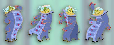
Little Shop of Drawers
Dial "M" for Monotonousnessisity
Mr. Right Foot
But then again, they also said they didn't like the font we used in our bible. Wicked.
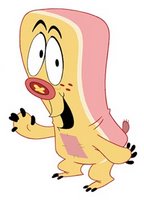
 This was our original Preston Pyjamabag. After asking for Sponge Bob, Nick thought it looked too Sponge Bob - hmmm. I think if you cut open Sponge Bob PeeWee Herman would fly out anyway - what's original anymore?
 This was Preston after the "nick" incident.
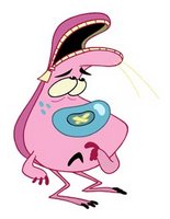
 Older versions of the characters were fun but not as Flash friendly as we needed them to be and we've since redesigned them - see below post.
6 comments:
These are some of the most inventive designs I have ever seen. Good Show!
I'd love this show to hit TV!
Steve
www.stephenstudios.com
THE FONT!!!! Oh my god, it's universal! we come up against the same crap in New Zealand. Screw what anyone says, your designs (and ideas) are awesome. Keep on trucking hombre!
Todd, you tell funny stories!
This this a real cute looking show.
This looks really cool, great design
love these characters!!Wicked design!! They make me laugh!!
Post a Comment